Accessible Online Menus


Overview

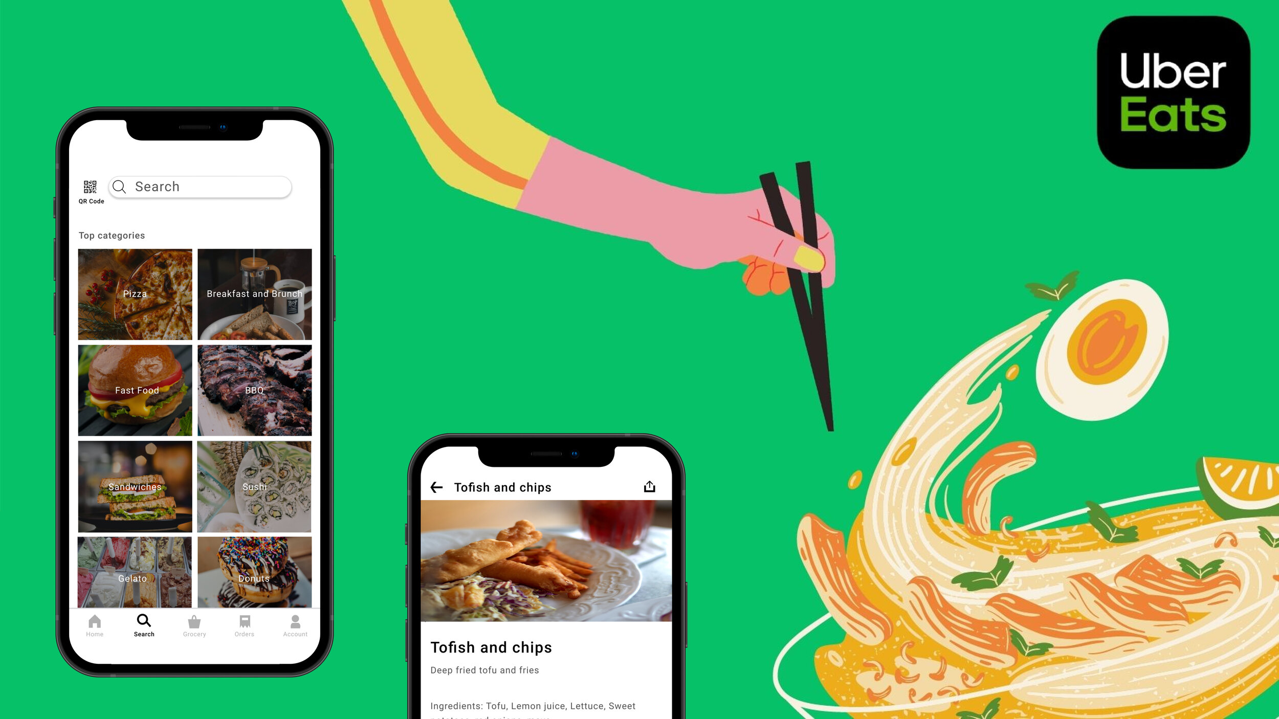
Project People with visual impairments often express difficulty using online menus. With COVID, the reliance on these inaccessible menus has only grown. To address this issue, I designed three features that Uber Eats could integrate within their app to improve user experiences.

*This is a student project at NYU, I am not affiliated with Uber Eats


Group 18.jpg
 
Group 7.jpg
 

 Problem

Unless a restaurant is part of a larger chain, the chances are that the online version of a menu was made by an employee of that restaurant who doesn’t specialize with accessibility. Therefore, online restaurant menus tend to end up being a scanned image of a physical menu in the form of a PDF file. Although this is quick and easy for the employee to make, the inaccessibility that comes with online menus made like this make it difficult for those with vision impairments who use a screen reader to view a menu.


How can customers who are blind or visually impaired have an easier experience viewing online menus independently?


Group 9 (2).jpg
 

 Research

Group 10 (2).png
 
 
01.png

PRIMARY RESEARCH

Before delving into specifics about online menu accessibility, I first wanted to get a basic understanding of one, how online menus are currently being used, two, how customers interact with restaurants during a pandemic. To this information first-hand, I decided to act like a fly on the wall at Tiger Sugar, a popular boba restaurant in Chinatown and observe customers for about an hour. Below are some of my observations.


Photo Credit to Meg Capone.

Photo Credit to Meg Capone.


Group 11 (3).png
  • Like many other restaurants during the pandemic, Tiger Sugar now redirected customers to order off their online menu through a QR code.

  • It was a bit hard to scan the QR code posted outside the restaurant window with the amount of people nearby.

  • It’s a chaotic environment. There’s a lot of movement in and out of the restaurant and a ton of glancing back between the phone and the LED display board displaying order numbers inside the restaurant.


02.png

SECONDARY RESEARCH

Going to Tiger Sugar was great to get a basic understanding of how restaurants were dealing with the pandemic, but it didn’t give me information on how visually impaired users interacted with online menus. Luckily, we have the internet. To start off, I did some basic research on some of the obstacles visually impaired users come across when using online menus. Most of this research came from articles and blog posts by visually impaired customers detailing their online menu experiences. Some of the common obstacles were:

  • Menus being incompatible with screen readers due to a lack of metadata

  • Accessibility issues involving contrast, color, navigation, font-size, etc.

  • Lack of information available for those with dietary restrictions

  • QR codes are handy (Sometimes)

Another form of research I did was a competitive analysis where I analyzed the features and their impact of four apps/programs, some made by visually impaired creators and some not. Not only is this a good way to get some inspiration for features in my solution, but it’s also a great way for me to see reasoning on why those features were made. Behind every feature lies a problem that the feature is aiming to address.


Competitive.JPG


03.png

VISUALIZING RESEARCH

To make this information more digestible, I compiled my research into a user persona and a customer journey map. The user persona is handy for showcasing a user’s goals and feelings, which helps me in turn create a customer journey map that details how obstacles in their goals affects the user.


Group 3 (4).jpg


Group 1 (4).jpg
 
Rectangle+18.jpg

 Key Findings


01 (1).png

COVID further popularized online menus through QR codes, adding another layer of inaccessibility since many restaurants use QR codes to lead to a scanned image of their physical menu. These images have no metadata, therefore, the screen reader cannot read it.


02 (1).png

Many menus don’t list out nutritional information in an easy way for screen readers to read. This makes it very difficult for users with dietary restrictions.

 
Rectangle 18 (1).jpg

 Design Process

 
Uber Eats Icon.png

Rather than making a standalone app, my solution will be a couple of features that improve accessibility that are integrated within Uber Eats, the most popular food ordering app for those who are visually impaired. This will make the overall process for ordering food simpler for users, for they can now view an accessible menu and order on the same app unlike competitors.


With my key findings in mind from my research and the idea that my final product would be a few features for Uber Eats, I created a Feature Prioritization map to help me ideate features and sort which ones would be the most beneficial for users. Luckily, Uber Eats already had a few of the features I was thinking about implementing, leaving me with just three features to design.


Group 2 (5).jpg
 

 Features

 
01 (1).png

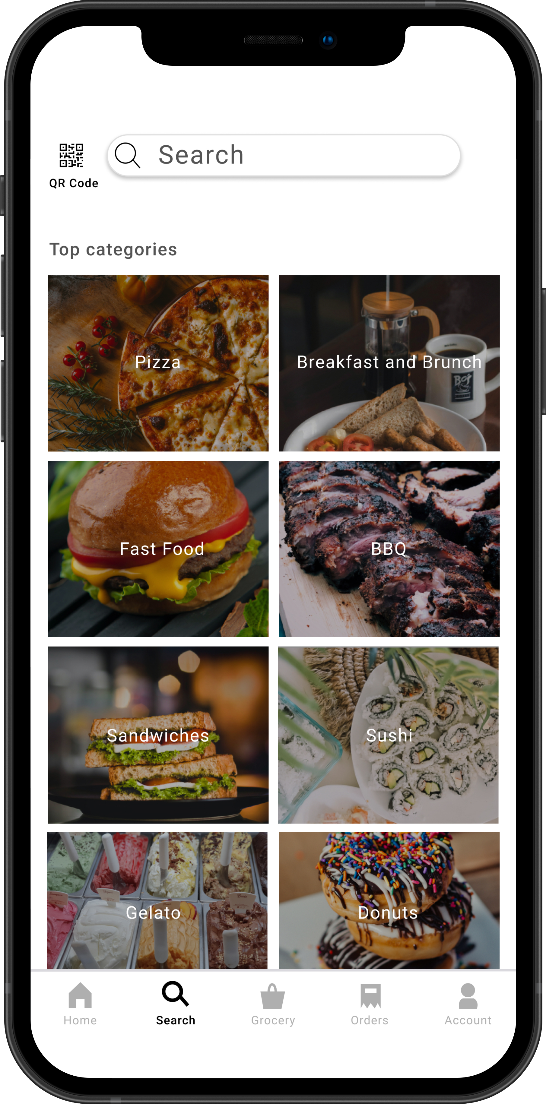
Search via QR Code

 
02 (1).png

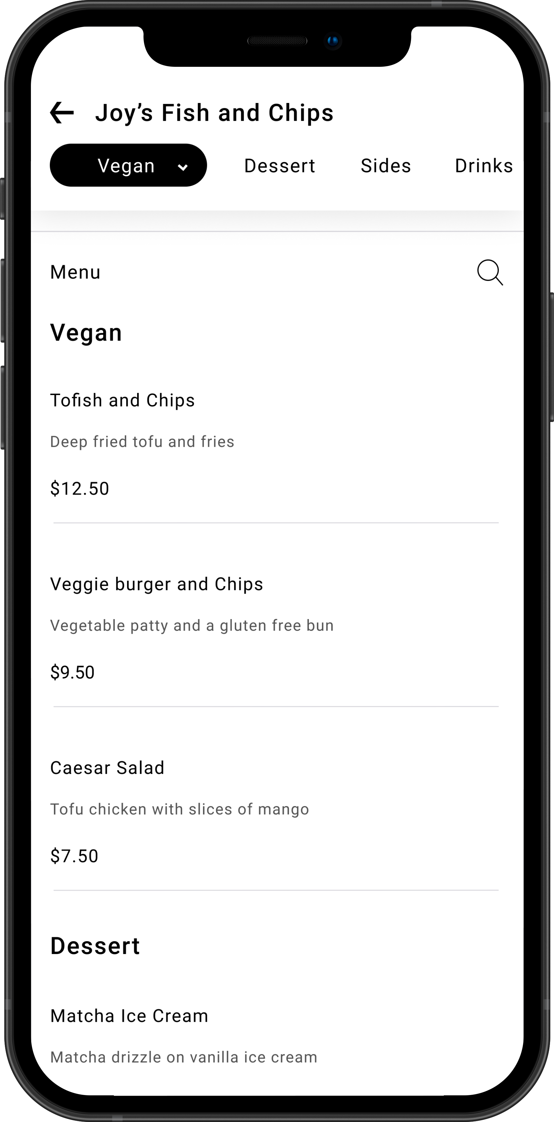
Dietary filter to filter restaurant items

 
03 (1).png

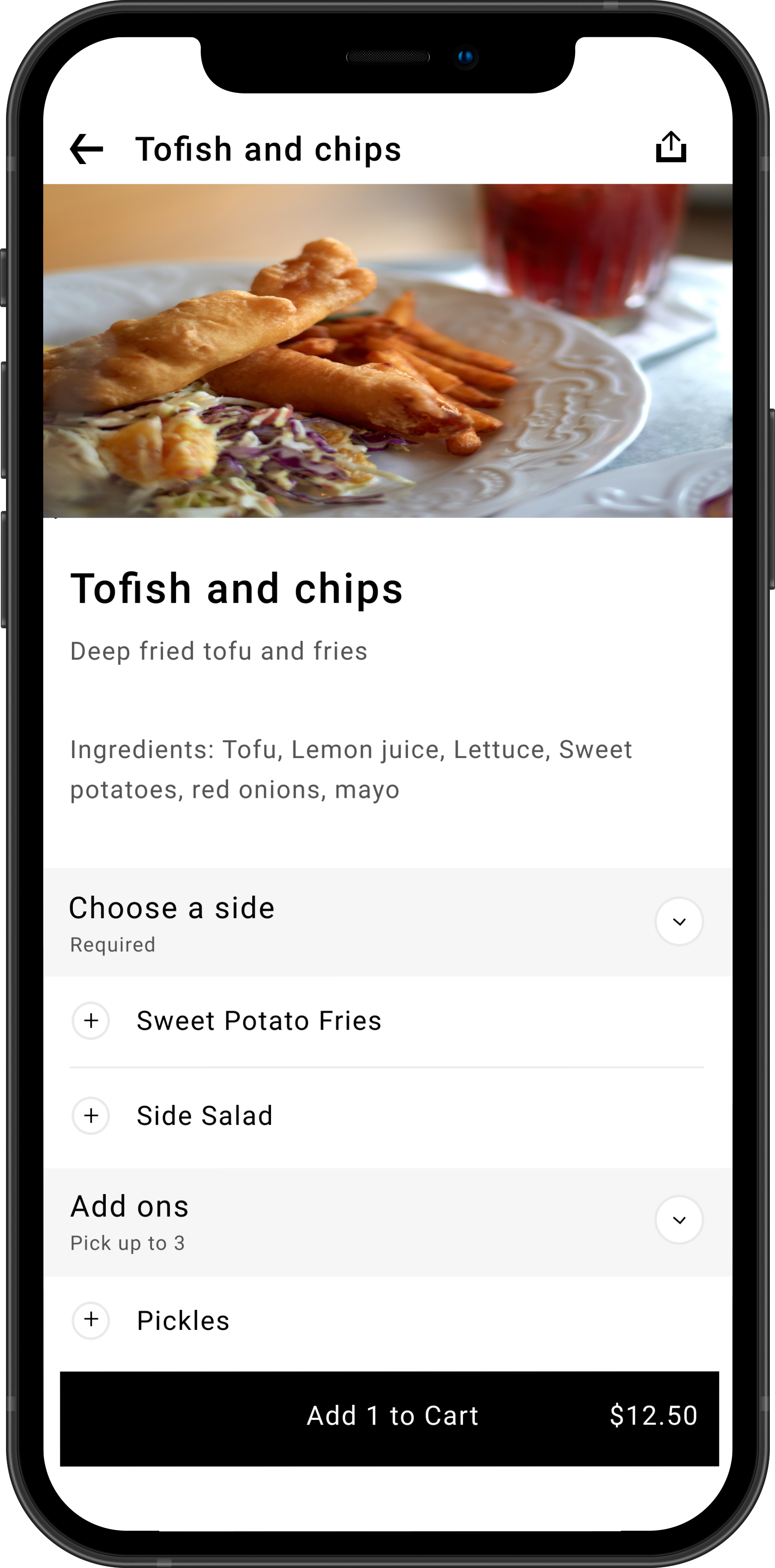
Mandatory text ingredient list

Rectangle 18 (1).jpg
 
 
01.png

Search by QR code

With this feature, if you scan the QR code for the restaurant menu through Uber Eats, it'll redirect you to the restaurant's Uber Eat's Accessible menu versus the standard restaurant menu PDF file. This is beneficial for users considering most restaurant PDF menus QR codes lead to are just a scanned image of the menu. This renders the menu inaccessible for blind users since their screen reader cannot read any of the content. This would be done through something called a “Multi URL QR Code”.


IMG-3870.jpg
 
right-arrow-icon-7580.png
 
dark-clay-iphone-x-mockup-front.png


02.png

Filter through restaurant items by dietary needs

This feature is based off of a feature Uber Eats currently has. On Uber Eat’s restaurant listings, you can filter through the restaurants based on specific dietary restrictions. However, that filter is not extended to items on a restaurant’s menu. This leaves visually impaired users with dietary restrictions to use their screen reader to tediously read many individual items before users can find one item that meets their needs. With this filter, users would only be shown menu items that meet their dietary needs, therefore reducing the amount of time users waste searching with their screen reader for food that meets their needs.


IMG-3871.jpg
 
 
right-arrow-icon-7580.png


dark-clay-iphone-x-mockup-front2.png


03.png

Mandatory Text Ingredient List

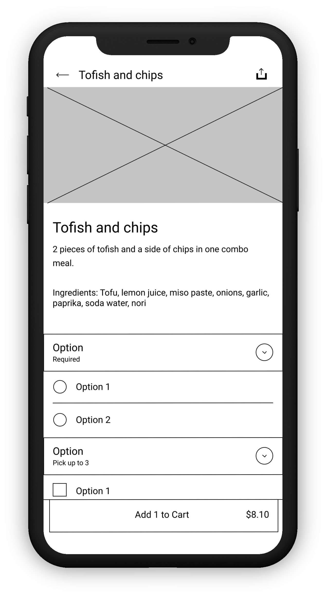
Though few restaurants use the description box in Uber Eats to input what ingredients go in a dish, most restaurants don't. Having a mandatory ingredient list in plain text makes it easier for visually impaired users to use Voiceover and other screen readers when looking at a dish's ingredients. This is important for blind users with dietary restrictions or allergies.


IMG-3869.jpg
 
right-arrow-icon-7580.png
oldwireframe.png
 

Usability Tests

Before committing my wireframe layout to my high fidelity prototype, I wanted to test the usability of it. So, let’s get to know my user who participated in my testing.


undraw_male_avatar_323b 2.png
 

This is Steve. He’s a 63 year old retired software engineer with impaired vision. His sight tends to get extremely blurry, especially with objects closer to him.


01.png

Search by QR Code:

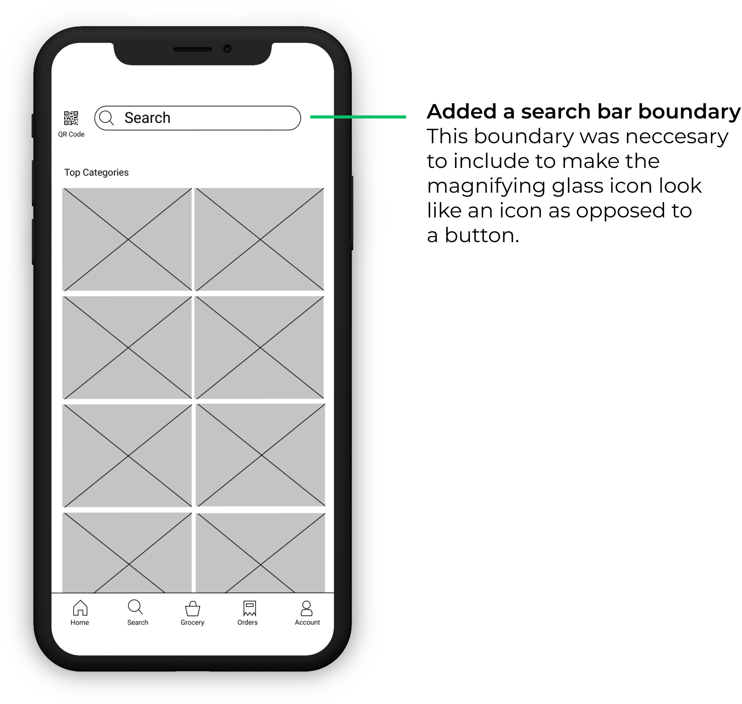
With the first interaction Steve had with the search page, he tried to click the magnifying glass, thinking it was a button. When I asked why he thought it was a button, he said it was because there were two icons next to each other. This showed me that there needed to be a clear indication on what qualified as a button and what didn’t.

Group 14 (2).png
 
 
02.png

Filter through restaurant items by dietary needs

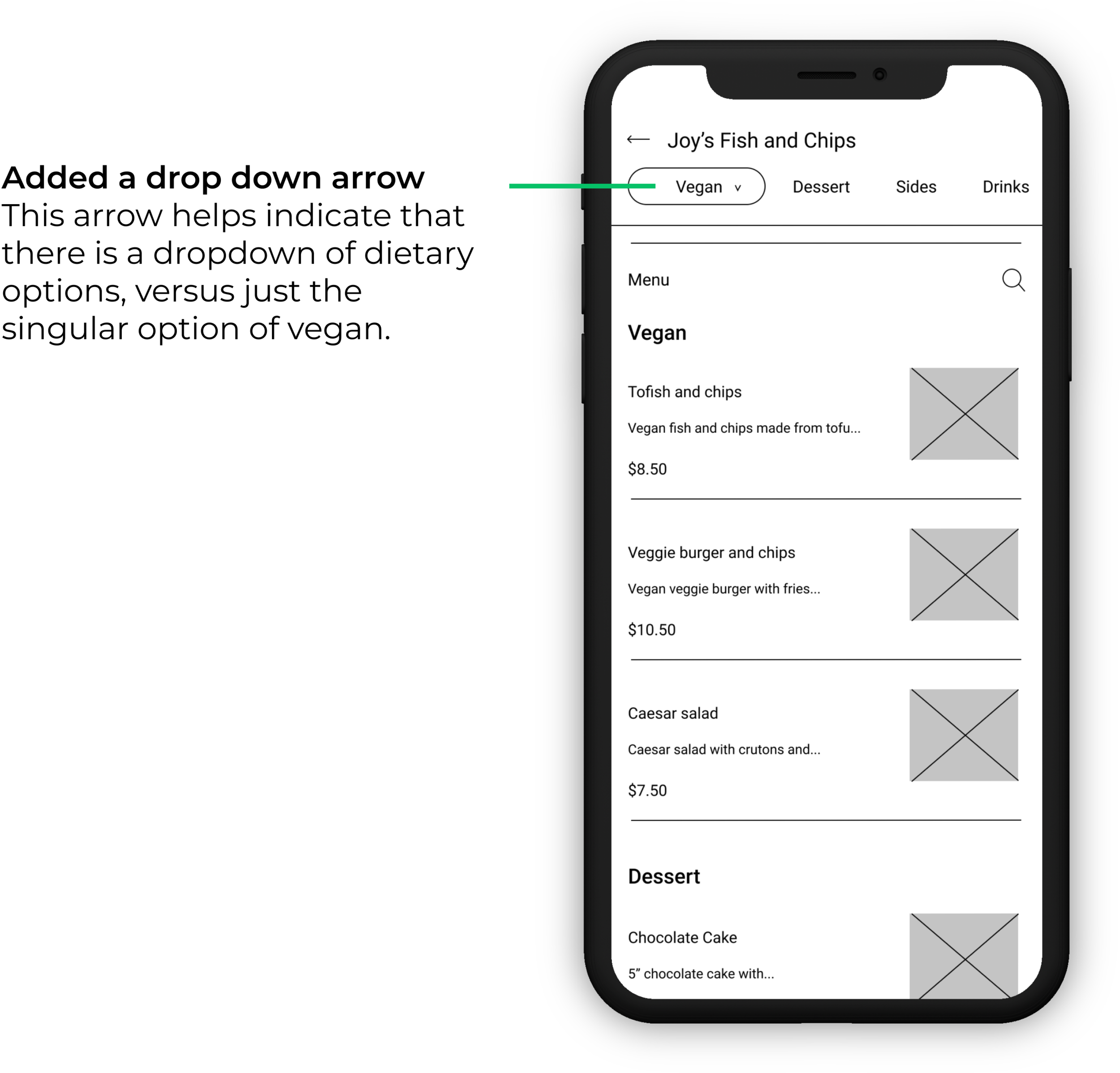
To test the dietary needs filter, the participant was asked to use the dietary dropdown menu. He replied with, "What dropdown menu?" Rather than the button labeled "Vegan" as being seen as a dropdown menu, he viewed it as similar to all of the other buttons next to it, which had no dropdown feature.

 
WHAT DROPDOWN MENU?
Group 15 (5).png
Rectangle 18.jpg

Final Wireframes


Using the findings from the usability tests, I then updated the wireframes to make a better user experience. On the search screen I added a boundary for the search bar, separating the magnifying glass icon and QR code button to the likelihood that someone would press the magnifying glass icon due to mistaking it as a button. I also added a drop down arrow on the dietary filters screen to make it clearer to users that there is a drop down of several different dietary needs that can be applied to that filter.


 Final Design


“Making eating well effortless for everyone, everywhere”

Untitled design (2).jpg
Rectangle 18 (1).jpg