App Redesign
OVERVIEW
Project Redesign Qnary’s mobile app in accordance to the company style guide while incorporating Qnary branding elements and improving user experiences.

OVERVIEW
Project Redesign Qnary’s mobile app in accordance to the company style guide while incorporating Qnary branding elements and improving user experiences.

To begin the redesign process, I was given screenshots of the current version of the Qnary app to use as a base design. Users were already familiar with the app’s design, so completely changing it would likely be startling and cause confusion among the user base. So, I focused more on analyzing what problems currently existed on the app and brainstorming how to solve them.


The first issue I found with the app’s design is a lack of branding elements. As some of the employees in the office said, “This doesn’t scream Qnary.” The app design is very clean and minimalistic, but the only element of branding related to Qnary was the integration of very small amounts of the color blue. Although blue is one of Qnary’s colors, blue is a very common color among social media (Ex. Facebook, Tumblr, Twitter, just to name a few). As a result, blue has become considered generic in some cases.


The second problem I came across with the app Qnary currently had in place was that some UI elements, such as buttons and icons, confused their users. In many cases, the symbols used to represent a button weren’t viewed as clickable by users. Therefore, users wouldn’t click on some of the buttons and therefore miss out on some of the app’s features.
In order to make the app design seem more personalized to Qnary, I created several design templates with the company’s primary color, yellow. I did this by adding in some Qnary’s yellow logo and adding yellow to the UI elements on the landing screen. For my first round of designs, I created 7 new designs for the home screen that would be easily transferable onto other screens of the app.
From my first round of designs, I usually eliminate a few designs that I believe aren’t as effective before presenting them to the design and product management team. Before presenting my designs to the other teams, I eliminated 2 out of the 7 designs due to UX issues. Both of these designs had elements that consisted of thin yellow lines. Yellow is a difficult color for many to actually see, but it becomes nearly impossible when the the yellow has thin strokes. It creates a lot of strain on the eyes for users with good vision and makes it nearly impossible for those with vision impairments (which are more prominent in Qnary’s older user base) to see the yellow. Then after I showed the design team the remaining 5 designs, they eliminated two more.


I then used the remaining three designs as a starting point for incorporating the feedback I received from the the design team. Per their feedback, I added even more yellow into my designs and incorporated several variations of Qnary’s logos into the designs. For this design round, I created 6 new designs.


Rather than doing another elimination round with my designs, the design team held a group vote to see which design was the most in favor.
Once the design was selected, I applied the same elements from that design onto other screens of the app to maintain design consistency.


After settling on the final design that would be used on the app I began to shift my focus to how users interacted with the app as a whole.


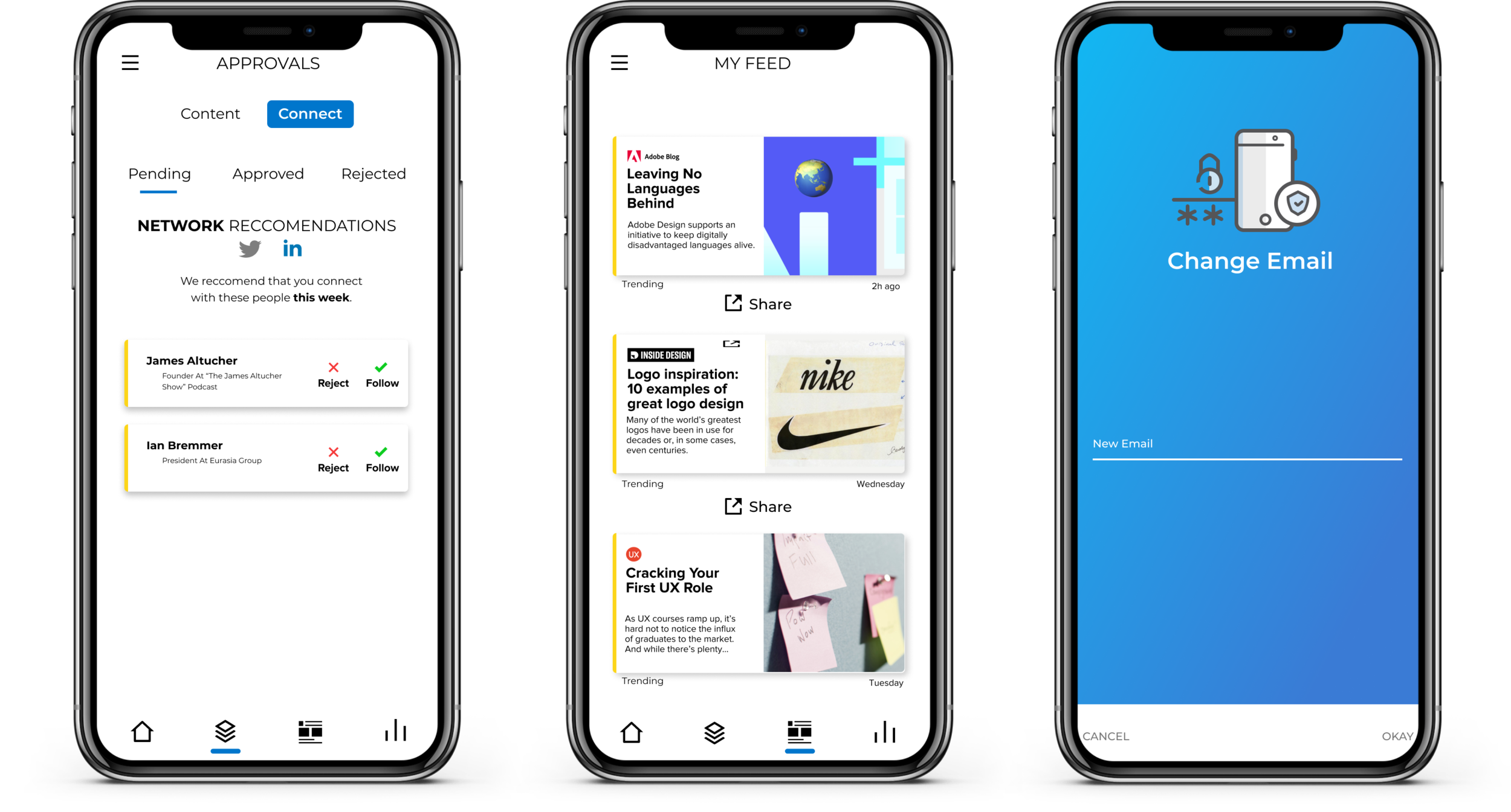
I made two major changes to the landing page of the app. One, I added a header at the top of the screen labeled “Approvals”. It’s important for users to understand where they are currently positioned in terms of navigation. It increases their confidence that they understand how to navigate the app as a whole.
Additionally, I added a badge icon next to “Connect”. This badge icon serves as a notification, informing users that they have new pending “Connect” invites. This change was especially vital since users had provided the design team feedback that they tended to forget about the “Connect” tab and their pending invites. Before this change, they didn’t many of them weren’t able to even experience half of the apps’ features!

As I reviewed user feedback, I started to notice that users were having difficulties accessing their other social media on the “Connect” screen. When you open the connect screen, by default you are shown the connect invites you have on Twitter. However, you are also able to check your invites on LinkedIn, which many users weren’t aware of. This was largely due to to the UI on the screen. Take a look at the gif below.

In the original design of this screen, you would switch between Twitter and Linked in by pressing the gray arrow next to the corresponding social media icon. There are two primary issues with this design.
The arrow isn’t very intuitive. What does it mean? Usually, an arrow is a fine choice when navigating through websites and screens, because we’re expecting to be led somewhere by clicking that arrow. However, in this case the arrow isn’t mean to navigate, but rather switch, from one social media to another.
You can’t see the other social media options available. If a user hadn’t noticed the gray arrow and assumed it led them somewhere, they would only see the Twitter logo by default and assume that Twitter was the only social media option they had. Users have to be aware that they have other options, even if they’re not going to select those options.

Here is the new design for switching between the two social media platforms. This time, you can see that there are two options for social media, alerting users that there is more than one social media platform that they can view their invites on. This increases the likelihood that users will click between the two icons.
Additionally, I altered the colors of the logos depending on if the user is viewing the Twitter or LinkedIn invites. If the user is viewing Twitter invites, the LinkedIn icon becomes gray, and vice versa. This follows the convention that “Active” buttons or tabs will be colored or bold in comparison to buttons or tabs that are not active. It also is consistent with the design of the “Content” and “Connect” switching mechanism. If the user is viewing “Content” posts, the word “Content” is emphasized by a large blue rectangle behind it. That blue rectangle then switches to display behind “Connect” if the user is viewing “Connect” invites. Since the user must use this type of switching mechanism in order to get to the “Connect” screen, then they will already have some familiarity with the mechanism to better understand it when they switch between the Twitter and LinkedIn icons.
The Qnary app has just relaunched with my designs implemented. As users work through the app, I’m sure there’ll be more feedback that I will need to incorporate in further revisions of the design. But, that comes with the territory of UX design. You keep reiterating to improve your designs, because nothing is ever truly “Done”. All I hope for is that I made someone’s goals on the app a little easier to accomplish.